The research led to design directives. - 1. In order to make the metrics meaningful, provide context and comparison data within and outside a course.
- 2. Balance insights and advice with feel good factor to keep users motivated.
- 3. The level of data-saviness and needs around data is widely different from one partner to another. Layer the information in a way that it can serve different level of details.
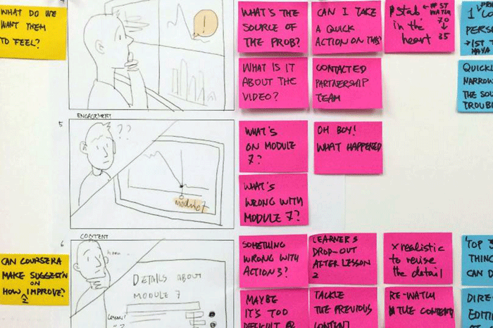
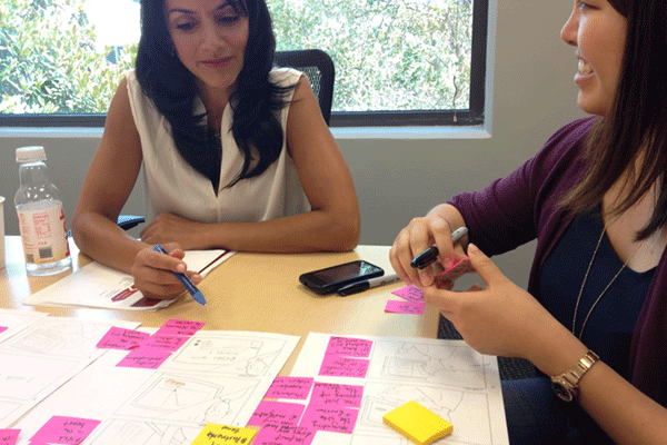
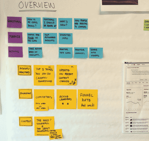
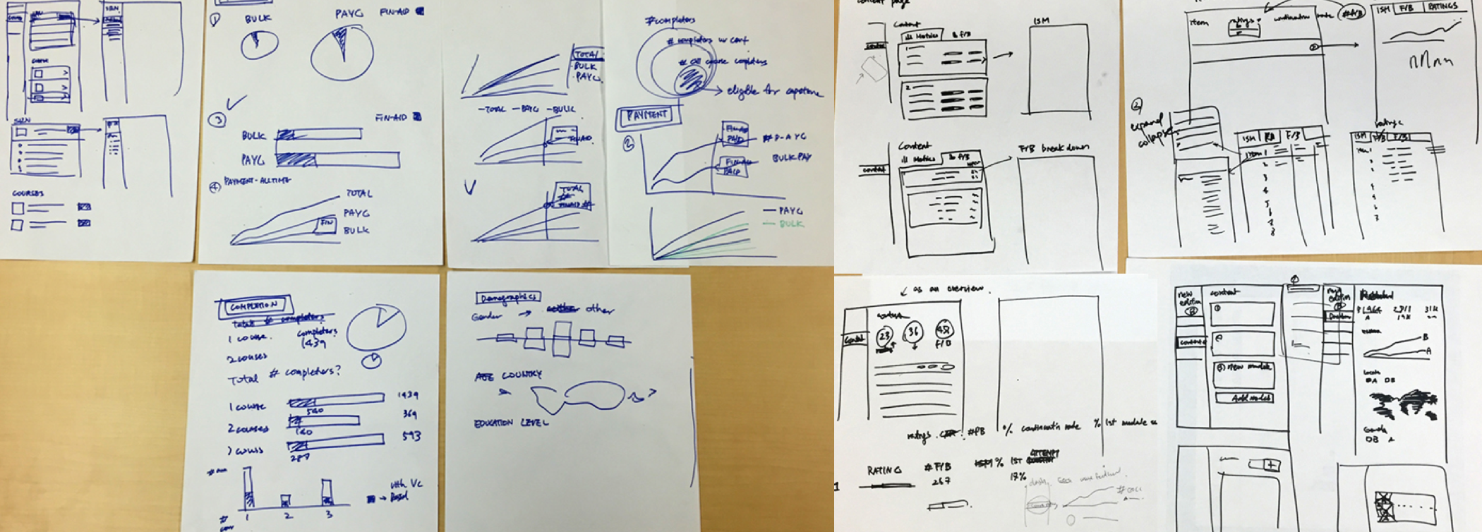
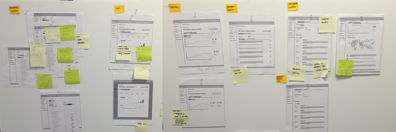
With these directives in hand, I developed sets of sketches and wireframes that went through several iterations based on internal and external feedback.
Concept to product
So far I have developed three Coursera dashboards - Partner, Specialization, and Course. Each dashboard serves different purposes depending on who the main users are and what the dashboards are used for.
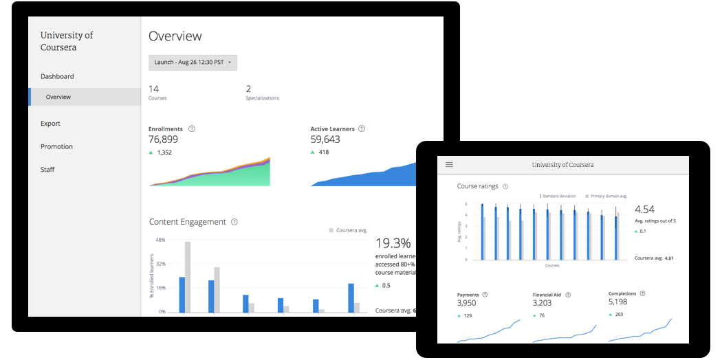
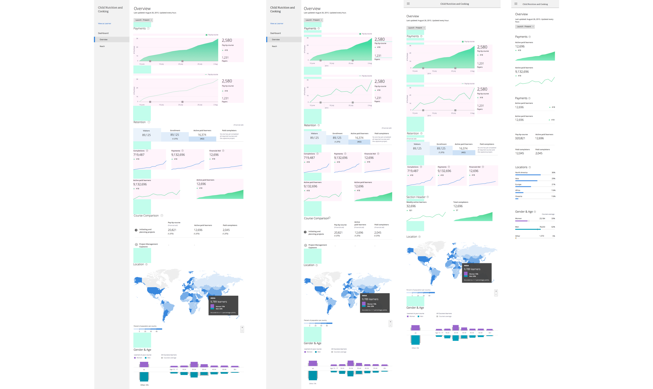
Partner dashboard is designed to provide a partner with a top-level overview of the key metrics across all their courses on Coursera. It's the 'Big numbers' dashboard where metrics are used to motivate our partners and re-enforce parnter-Coursera alignment. January 2016. All metrics are placeholders.
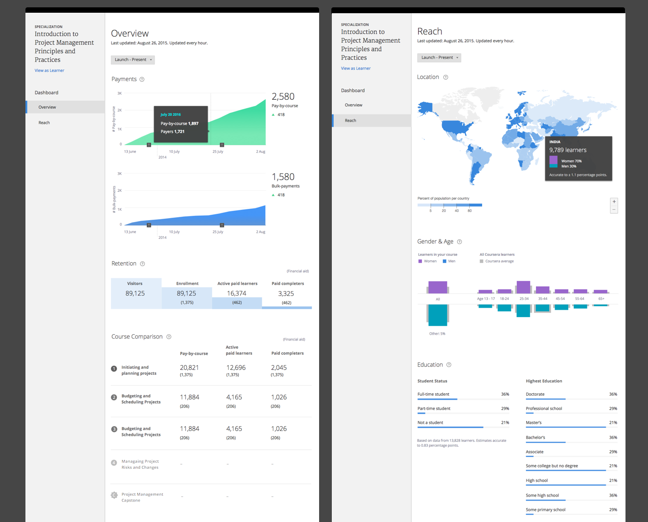
The metric hierarchy on Specializaionts dashboard reflect the most salient questions course teams ask when they launch and run Specializations - how much revenue is it generating? What is the retention between courses? September 2015. All metrics are placeholders.
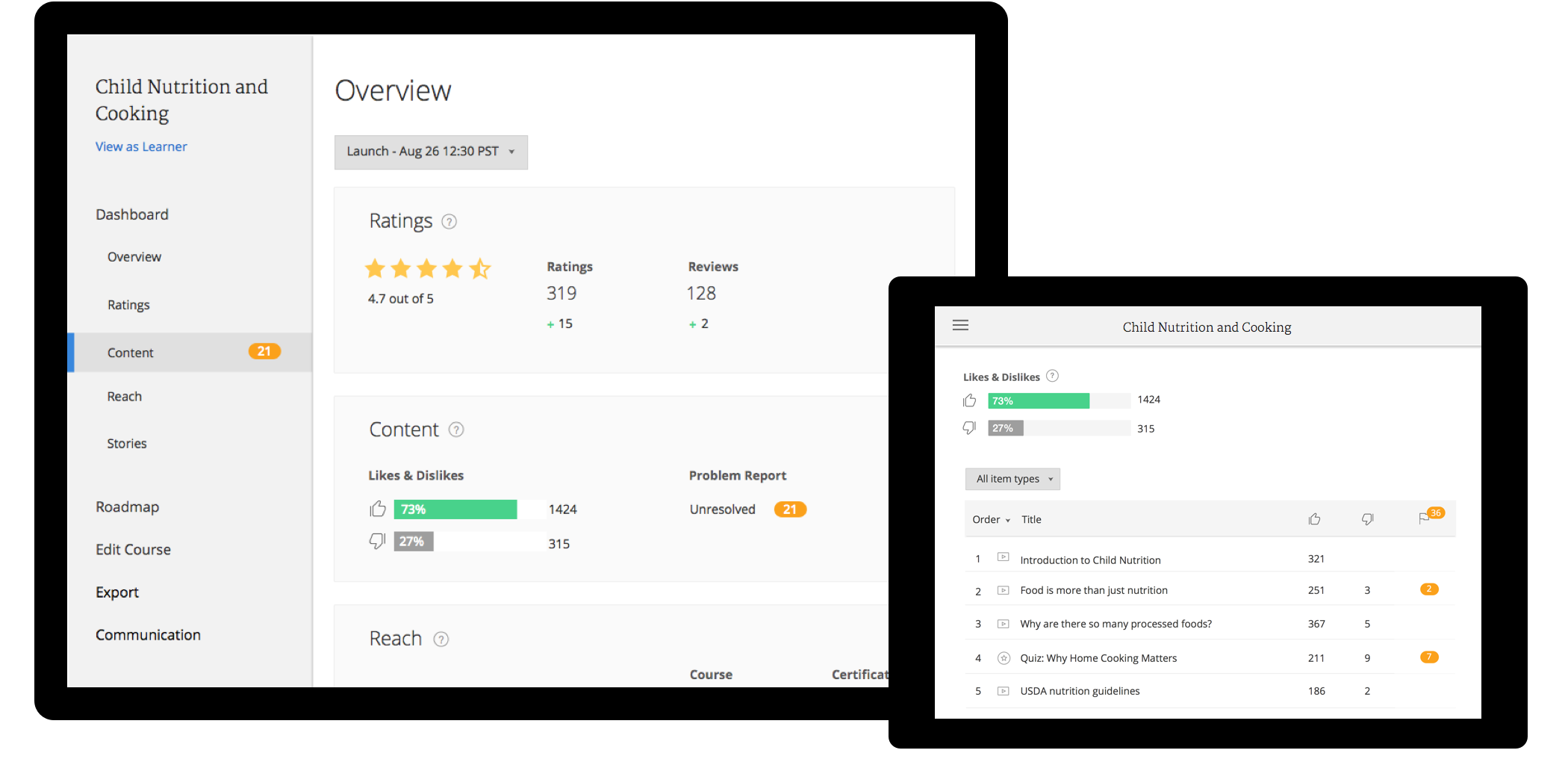
Course dashboard consists of four sub menus - Reach, Content, Ratings, and Stories. The dashboard is intended to deliver detailed insights on the health of course content. First development October 2014 then redesigned in November 2015. All metrics are placeholders.
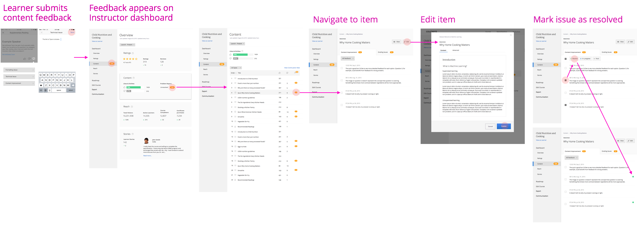
Since it's first introduction in 2014, the course dashboard continuously evolved. As we introduced Learner Ratings & Feedback in 2015, we replaced the behaviourial metrics on Content dashboard with more obective learner problem reports and feedback metrics. The flow allows users to easily monitor the flags and take action on the problem, thus making the dashboard truly actionable. The close integration of metric dashboard with content editor is currently pending a US patent.
After working on multiple dashboard projects, I initiated and designed modularization of dashboard elements to make design and engineering process more efficient.
The Result
The actionable data had direct impact to user behavior and content quality. Partners are using the Specialization dashboard to monitor and share the performance of their content and to calculate ROI. Course dashboards are being used to monitor direct learner responses that lead to more frequent iteration on course content. Recently a course team improved a course rating by over .9 points (2.8 to 3.7) by addressing the issues that were brought up by learners through the feedback UI.